The Easiest Font to Read Is Already on Your Phone

By: Talon Homer  | 
The best font for readability is a simple sans serif font. bortonia / Getty Images

When it comes to typing a message, font choice can sometimes add a creative touch to your work, but for mass media formats like newspapers, academic papers, TV and popular web sites, sticking to a legible font is often more important than the flourish of decorative fonts.

Here, we'll go over some candidates for the easiest font to read in print and web documents, along with some history of typesetting and what makes for a readable font.

Advertisement

Common Qualities of the Most Readable Fonts

The easiest fonts to read are designed to be able to reach the most amount of people. They may be reading the font off of printed documents, road signs, or on mobile devices with low resolution screens. The reader could also potentially have eyesight problems or be a fair distance away from the text.

With these factors in mind, the most readable fonts need to have very distinguishable characters that can be easily read by the viewer at a variety of font sizes. The ideal font can serve everyone as long as they are literate, and it will also make the process easier for those just learning to read. Font weight is also an important factor.

Advertisement

For instance, things like road signs which are intended to be viewed far distances generally feature bold letter shapes. Readable font should also make capital letters and lowercase letters easy to tell apart from one another, with careful spacing between words and characters to make sure nothing appears to overlap or spread too far apart.

Serif vs. Sans Serif fonts

While browsing online, reading a newspaper or typing in a document editor like Microsoft Word, there are thousands of different fonts you could potentially encounter. However, popular fonts tend to fall in one of two categories: serif fonts and sans serif fonts.

Serif Fonts

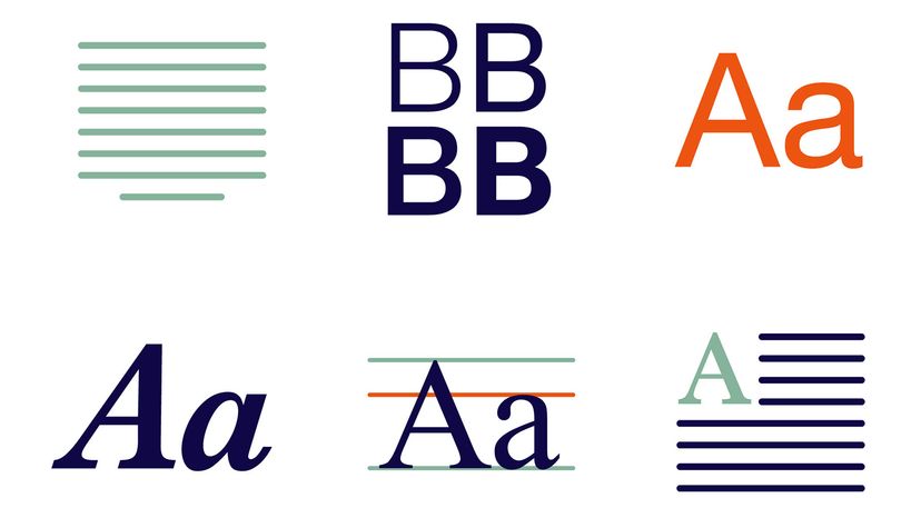
The serif font style (named from the Germanic word for "pen stroke") was first designed in the late 1700s and features little flourishes or "tails" on each letter that give the fonts a bit of character.

Advertisement

These tails also showed off the precision quality of the printing dies which were becoming more widely available at the time.

Serif fonts look great blown up to big sizes and on high-resolution computer screens, but they tend to have poorer readability at smaller text sizes. For this reason, newspapers and online articles tend to use a serif font for the headline instead of the main body text of the piece.

Sans Serif Fonts

On the other hand, sans serif typeface is a derivative of serif font and attempts to solve some of its apparent shortcomings. Sans serif fonts do away with the little flourishes of serif and instead focus on bolder letters with very straight lines and uniform curves for maximum legibility.

Sans serif tends to be the easiest type of font to read, sometimes sacrificing creative potential. They're also used in graphic designs that aim to look more "modern" versus older serif typefaces.

Advertisement

4 of the Best Sans Serif Fonts

  1. Arial: Originally based on Helvetica, this is a supremely readable font that can be found on all types of software and web pages.
  2. Calibri: In 2007, Calibri replaced Times New Roman as the default font for Microsoft Office apps and became one of the most prolific fonts in the digital space before being replaced itself in 2023 (the new kid on the block is Aptos).
  3. Open Sans: This popular sans serif font was commissioned by Google in 2011 and soon became the standard font for the Android mobile operating system.
  4. Montserrat: This is a very simple, classy, yet easy-to-read font that looks great in thinner styles, bolded or in italics.

Advertisement

4 of the Best Serif Fonts

  1. Times New Roman: First commissioned by London newspaper The Times in 1931, this ubiquitous serif font became a popular choice for book printing and is now included in most major computer operating systems.
  2. Berkeley Old Style: Also known as "Californian" font, this typeface created for the University of California newspaper in the 1930's can add a bit of class to your work without sacrificing readability.
  3. Larken: This is the font choice for adding bold, stylish letters to a poster or book title.
  4. Merriweather: A popular font choice for modern book printing, this serif derivative has a distinct mid-century feel by combining strong modern lettering with some classical flourishes.

Advertisement

Dishonorable Mentions: Fonts to Avoid

  • Comic Sans: This sans serif font is technically one of the easiest fonts to read, but the exaggerated bubbly style of its lettering means it's the most commonly mocked by graphic designers.
  • Papyrus: Despite a clone typeface being used in the logo for the Avatar movies, this vaguely ancient-looking font has never been taken seriously.
  • Jokerman: This silly font's lettering includes a bunch of needless and inconsistent details which give it poor readability and generally make it too irregular to be used in a professional setting.
  • Wingdings: Before we had an emoji keyboard on our phones, this Microsoft Windows font replaced the characters on your keyboard with seemingly random icons and symbols. This is quite possible the least readable font in existence.

Advertisement

The First Printed Font

Basically everything that we take for granted today about fonts and typesetting started with the invention of the industrial printing press by Johannes Gutenberg in the 1400's. Before the invention of Gutenberg's press, nearly all books in European circulation were bound and inscribed by monks of the Catholic Church who copied the body text by hand over several weeks.

This was grueling work, causing books to be generally unaffordable to the commoner and literacy rates to be low. Gutenberg's invention drove down the cost of bookmaking and allowed literature to reach the masses.

Advertisement

The default font for this press, Blackletter, was initially based on the writing of the monks, with a big font size and bold, ornate letters. It had style, but it didn't have the readability required for mass media and web design.

Improving Legibility

In 1470, a French printer named Nicolas Jenson came up with what could be considered the first readable typeface: the "Roman" font.

This style did away with ornate flourishes and focused on distinctive letter shapes that were evenly spaced, making it much easier to read by the layman. Many modern variants of the typeset exist today including the popular font, Times New Roman.

Advertisement

Advertisement

Loading...